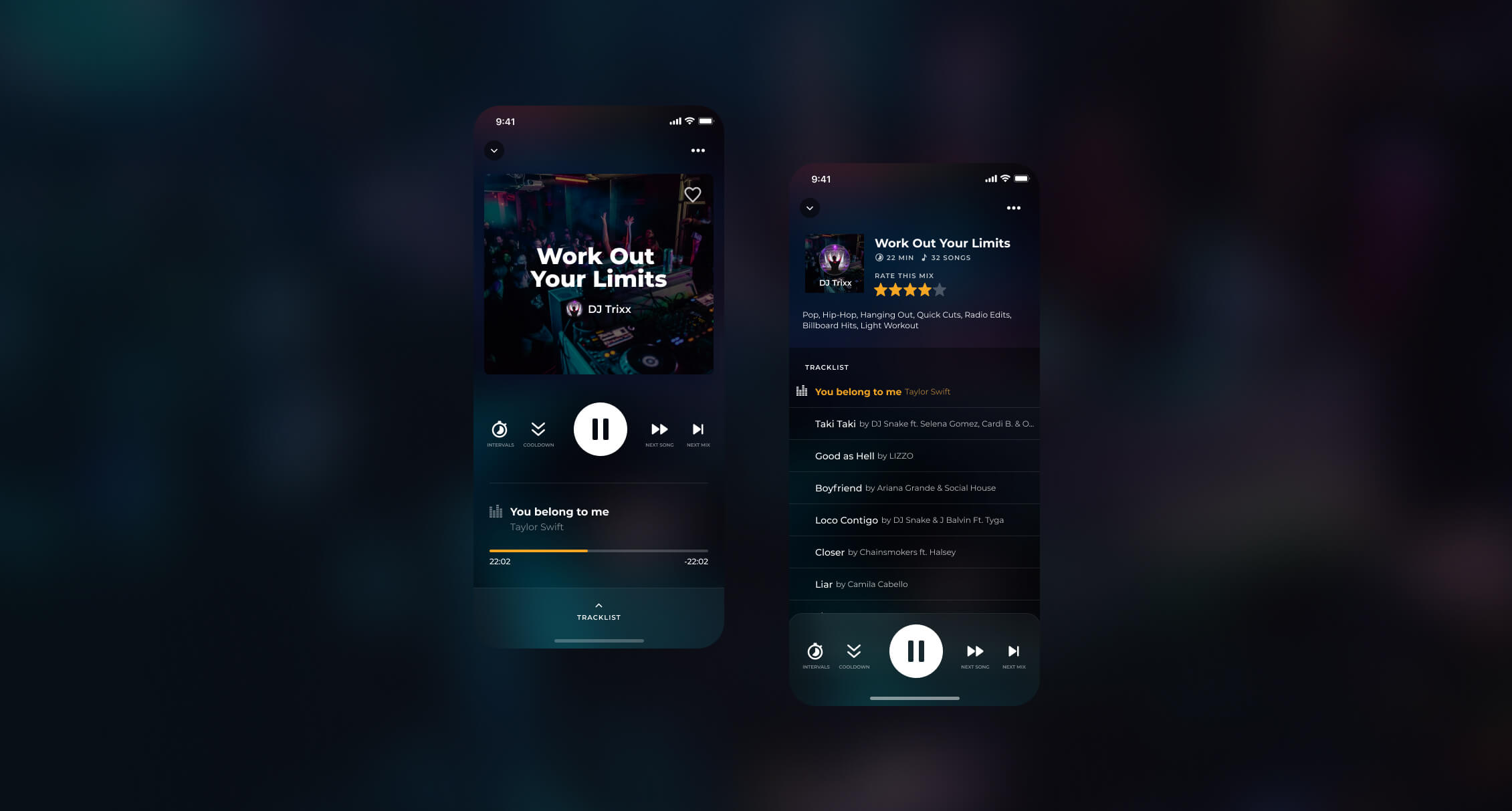
FITRADIO is a mobile app with millions of users that offers motivational workout music, audio guided workouts, tempo matching technology that matches music to your running pace, and much more…
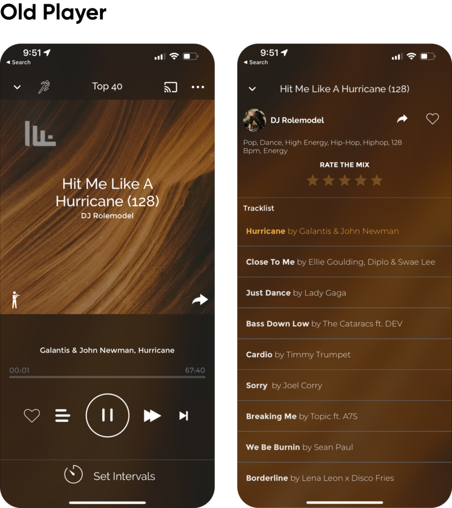
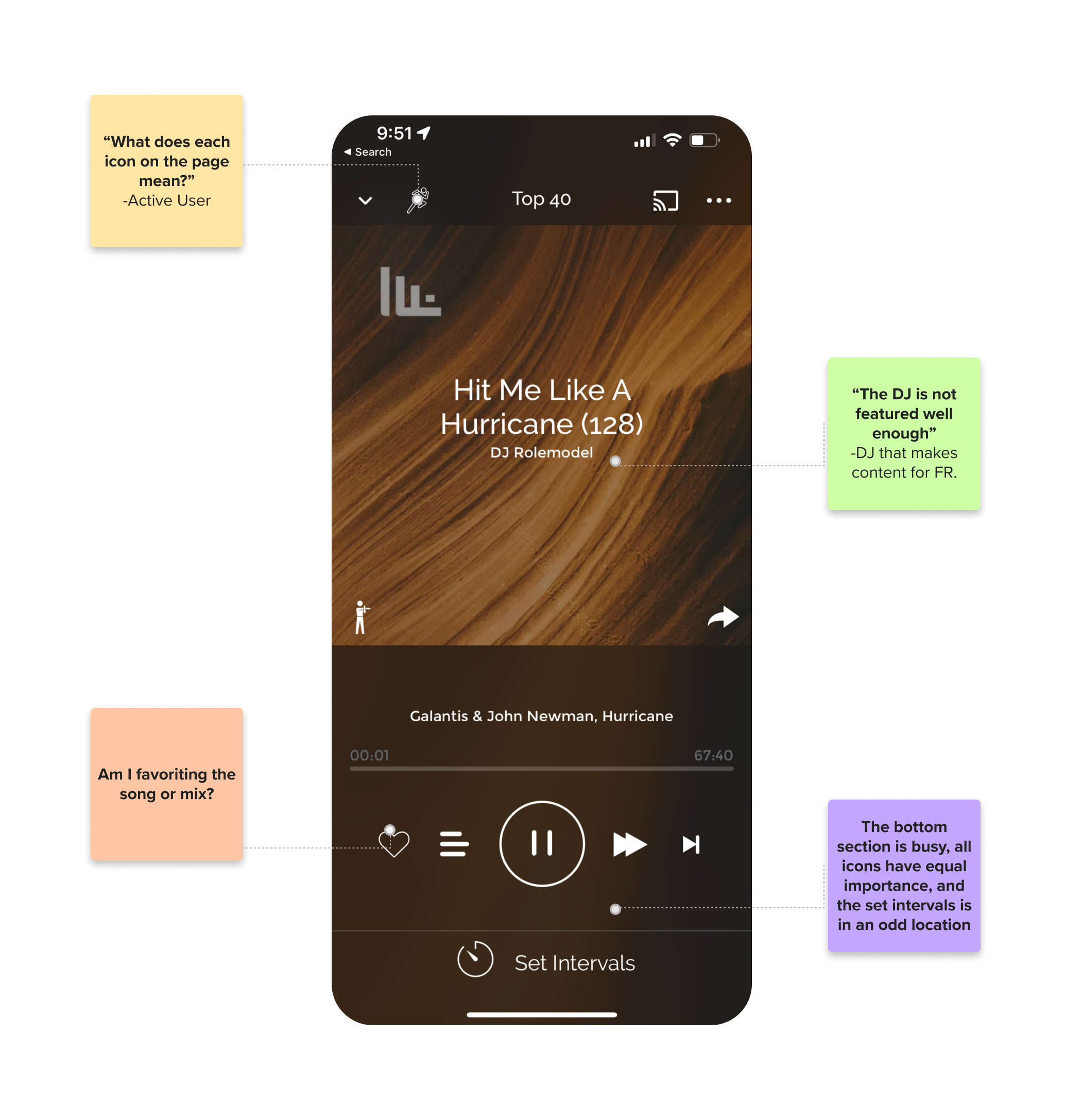
One of the most important features of the app is the music player. We received lots of feedback from users and DJ’s that make music for the app that the player was hard to use and not intuitive. I was brought on a project to reinvent the player to introduce a much more intuitive user interface that both users and DJs would love.
Role
- Responsible for leading the project from start to finish by collaborating with PMs, Engineers, and stakeholders to validate and launch project.
- Advocating for the user and defending decisions with data and real user feedback.
- Presenting my designs along with visual animations and interactions to marvel stakeholders and prove design and interaction thinking with visual examples.
Key Actions
- Cross-Functional Team Collaboration
- UX Research & Analysis
- User Testing
- Hi-Fidelity Design
- Animations & Microinteractions
The Problem
Through feedback from active users, DJ’s that make content for the app, and customer support we learned that the music player’s interface was not intuitive or promoting click through on some of the cool features like cool down, intervals, start run, etc…
92%
The percentage of time the average user spent on the player screen vs the whole app.
0.2%
Amount of users that used the cooldown, intervals, and start run features.
Goals
I conducted a workshop with the team to identify the main goals we wanted to achieve with the new player. With feedback from various teams, we learned that we wanted to focus on improving the experience for the user as this was the feature that most users complained about, retaining users for longer by providing a more delightful experience, and enticing users to use features like “cool-down” “start run” “intervals” and others that take place in the player.
The Process
Wireframes & User Flows
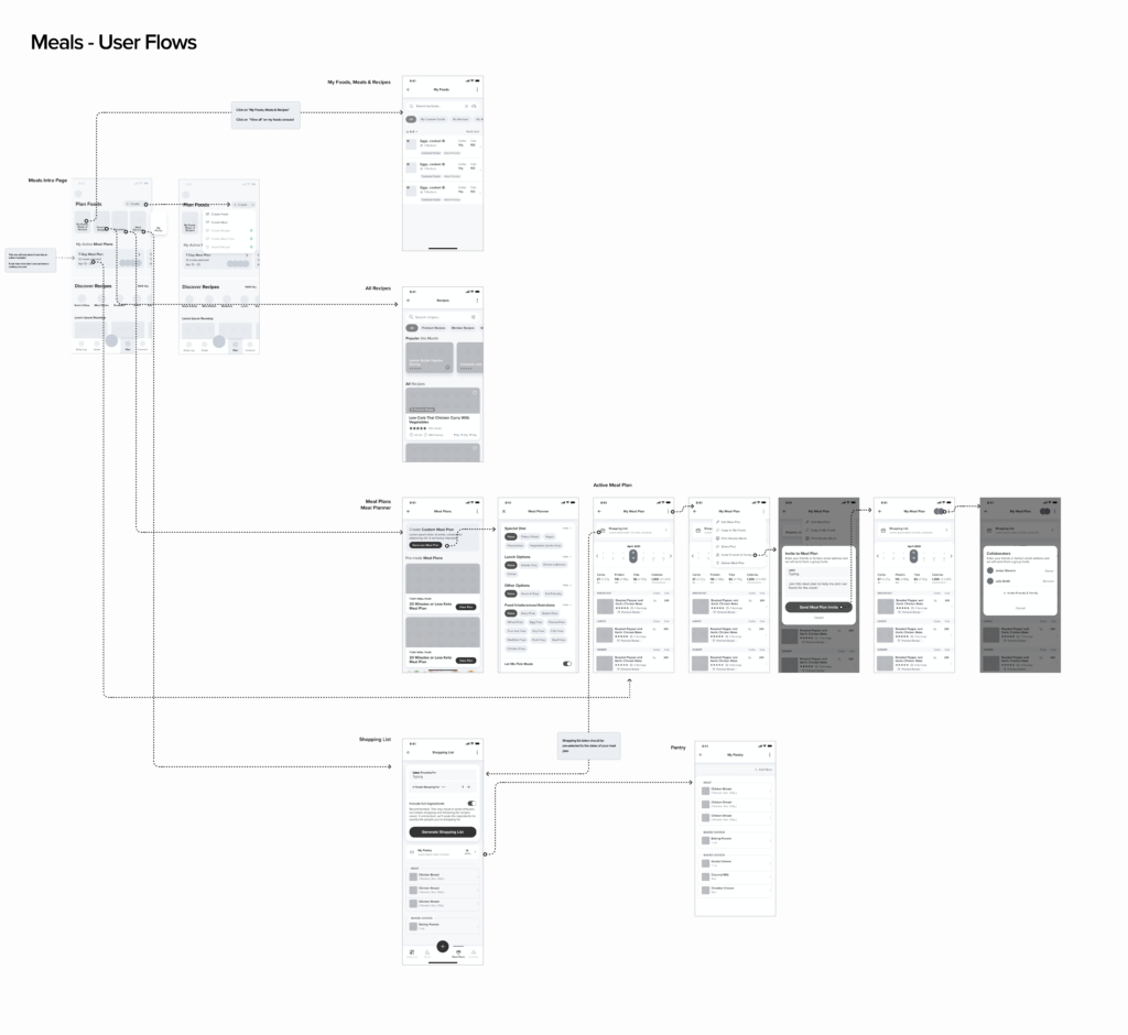
After having a good idea of our problems, goals, user pain points I had a ton of ideas on how to improve those frustrations. I spent some time wireframing and coming up with various solutions, presenting to the team, and iterating before settling on a final wireframe that I wanted to validate.
User Testing & Validation
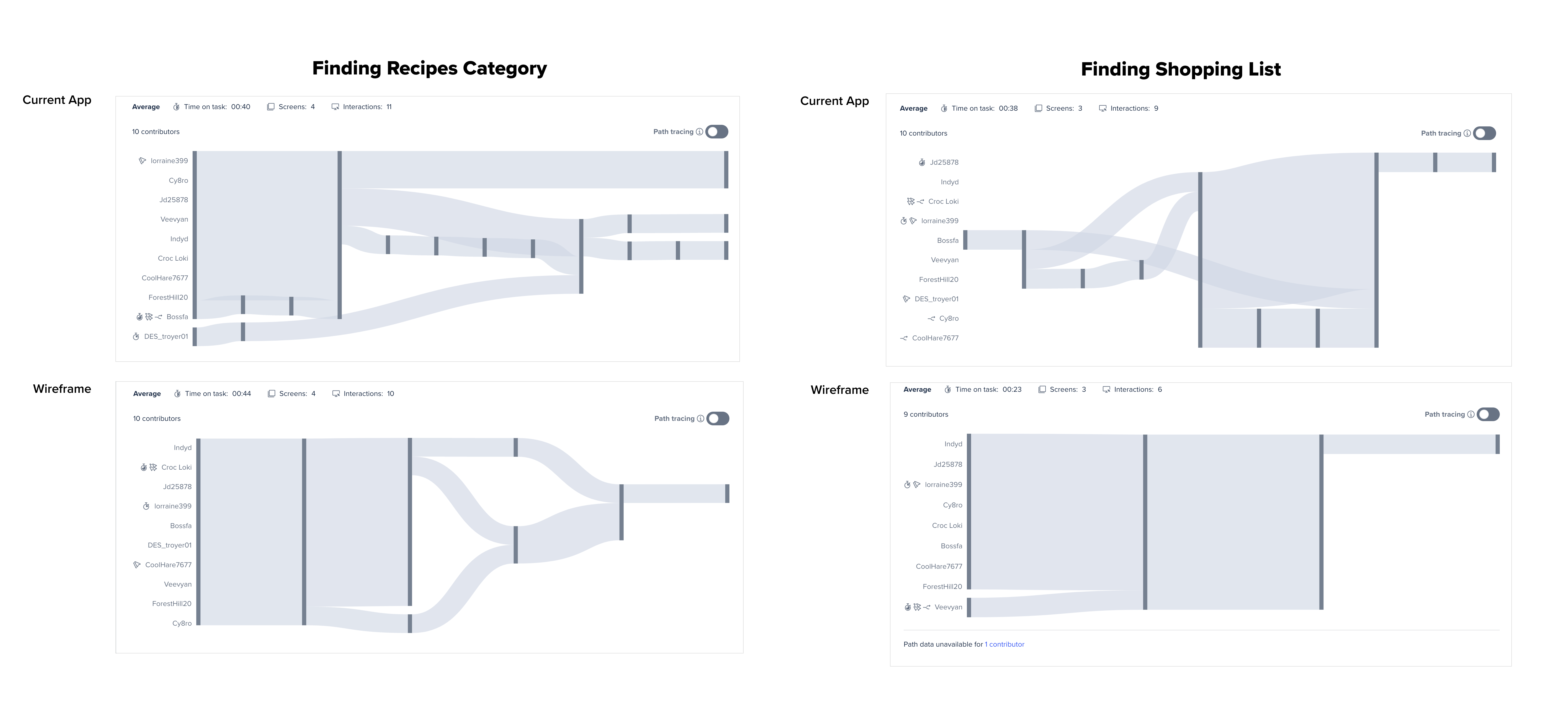
After testing on usertesting.com with 20 participants, as well as introducing the wireframes in our user interviews we received a lot of great feedback which we were able to iterate on and improve. Overall the experience was a huge improvement and we clearly noticed an improvement in users being able to find sections much more efficiently and faster. The large majority of users also commented on how the section felt more inviting and promoted them to browse more which was one of our main goals.
The Solutions
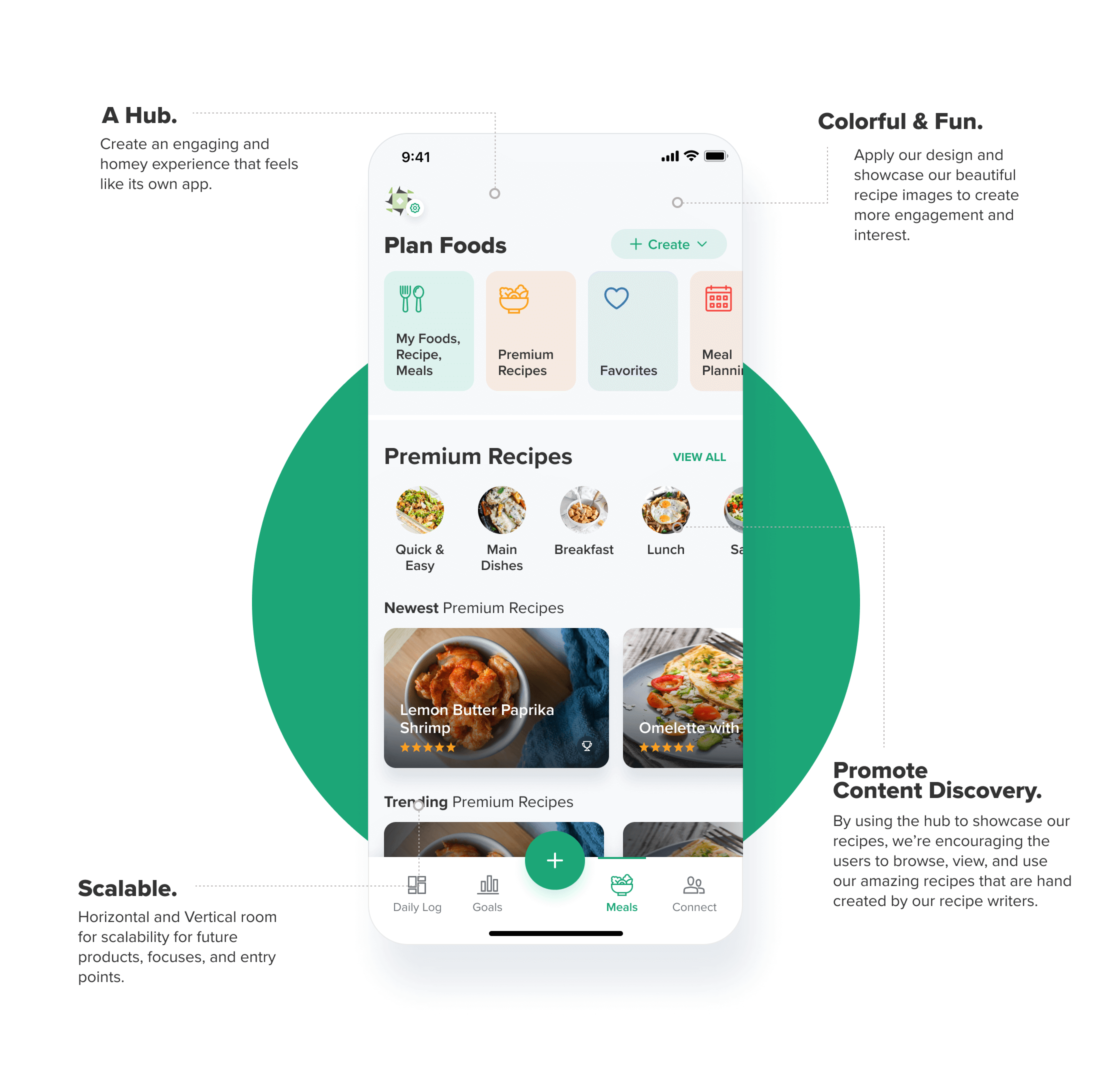
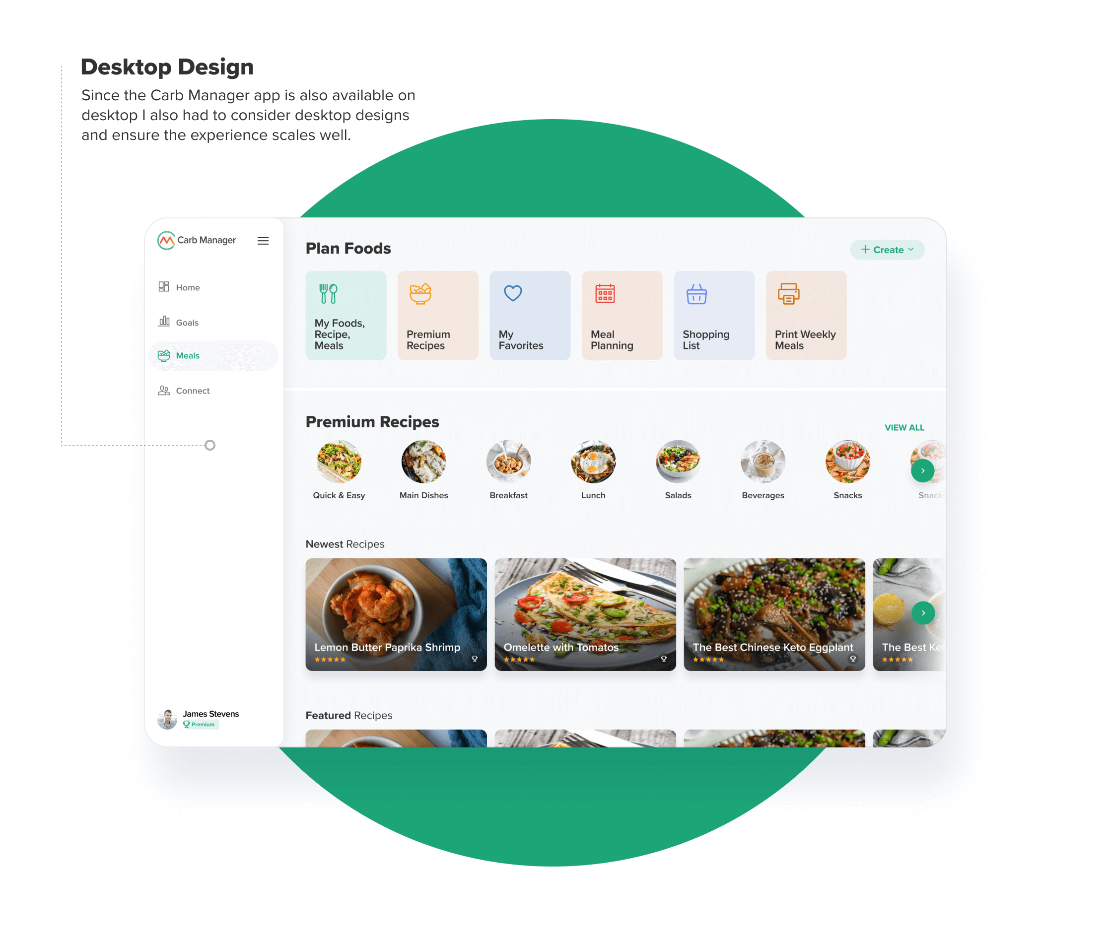
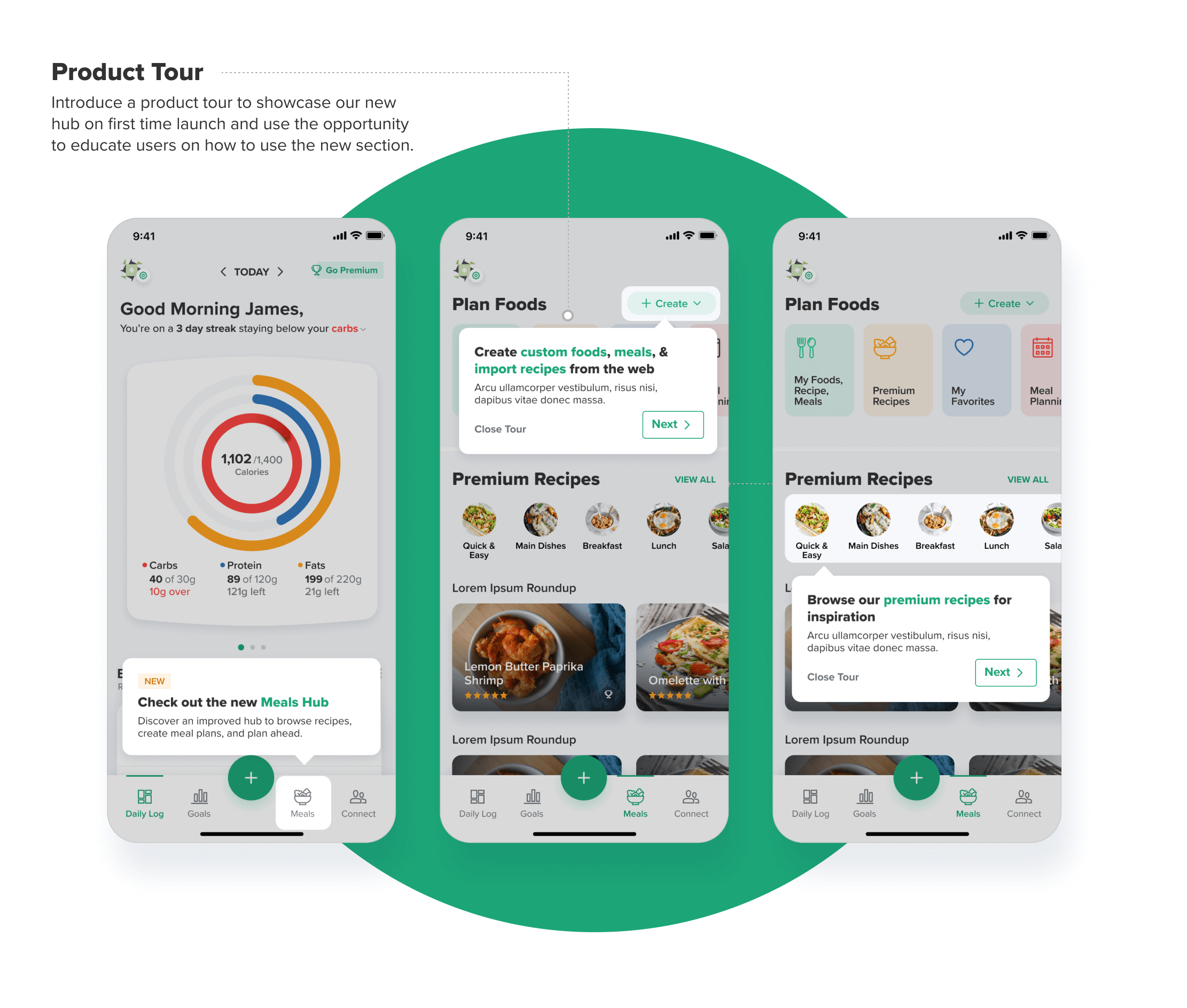
18.5%
Increase in recipe page views
9.1%
Increase in Meal Plans applied
+2.2
Increase in times average users click on the Meals tab per day.
The Result
After launching the hub we received great feedback from users and also validated our findings with data. The results demonstrated increases in recipe page visits which in turn led to more premium conversions, huge increase in meal plan creation and shopping list usage, and much more…
We also have plans to further improve the hub by providing a personalized experience for users where they can see recipes catered to their preferences, introducing their meal plans and allowing to edit, and much more…


