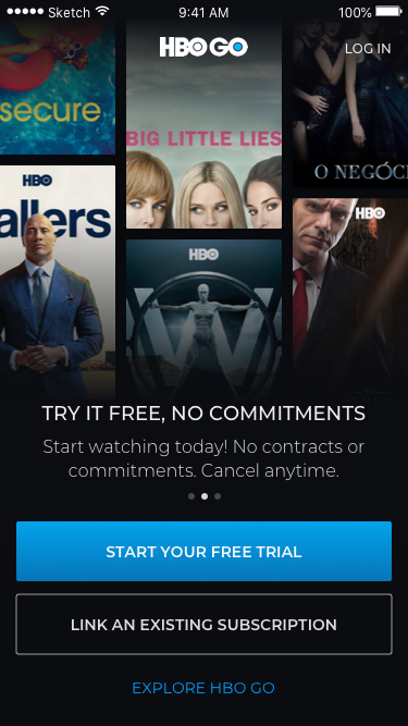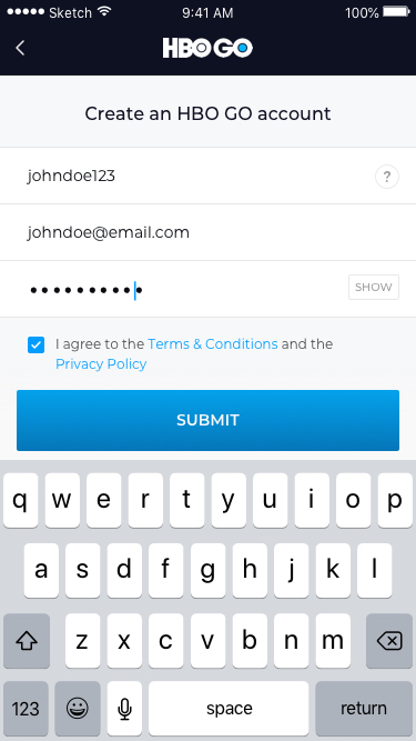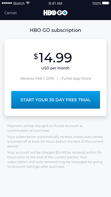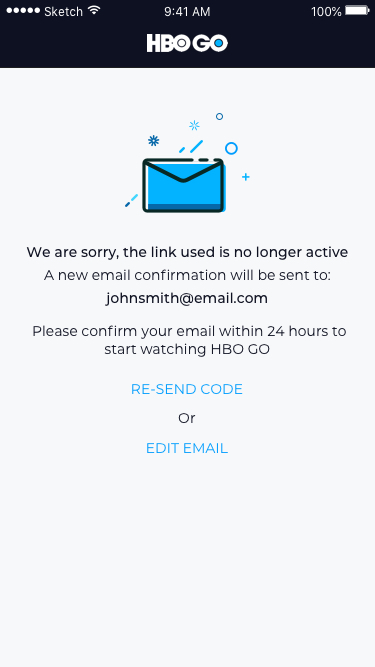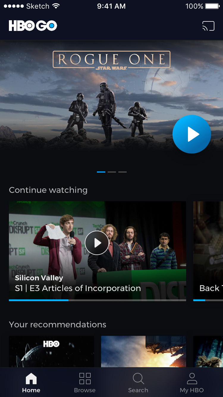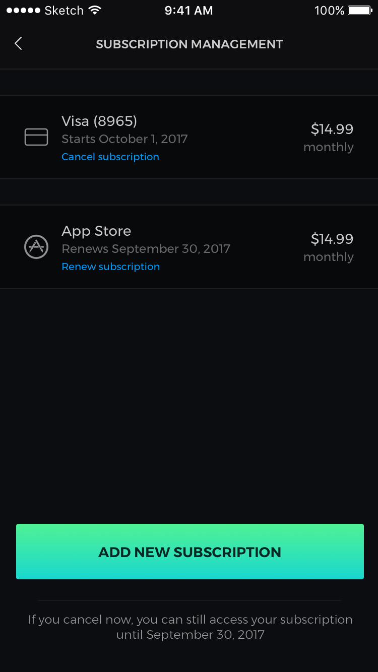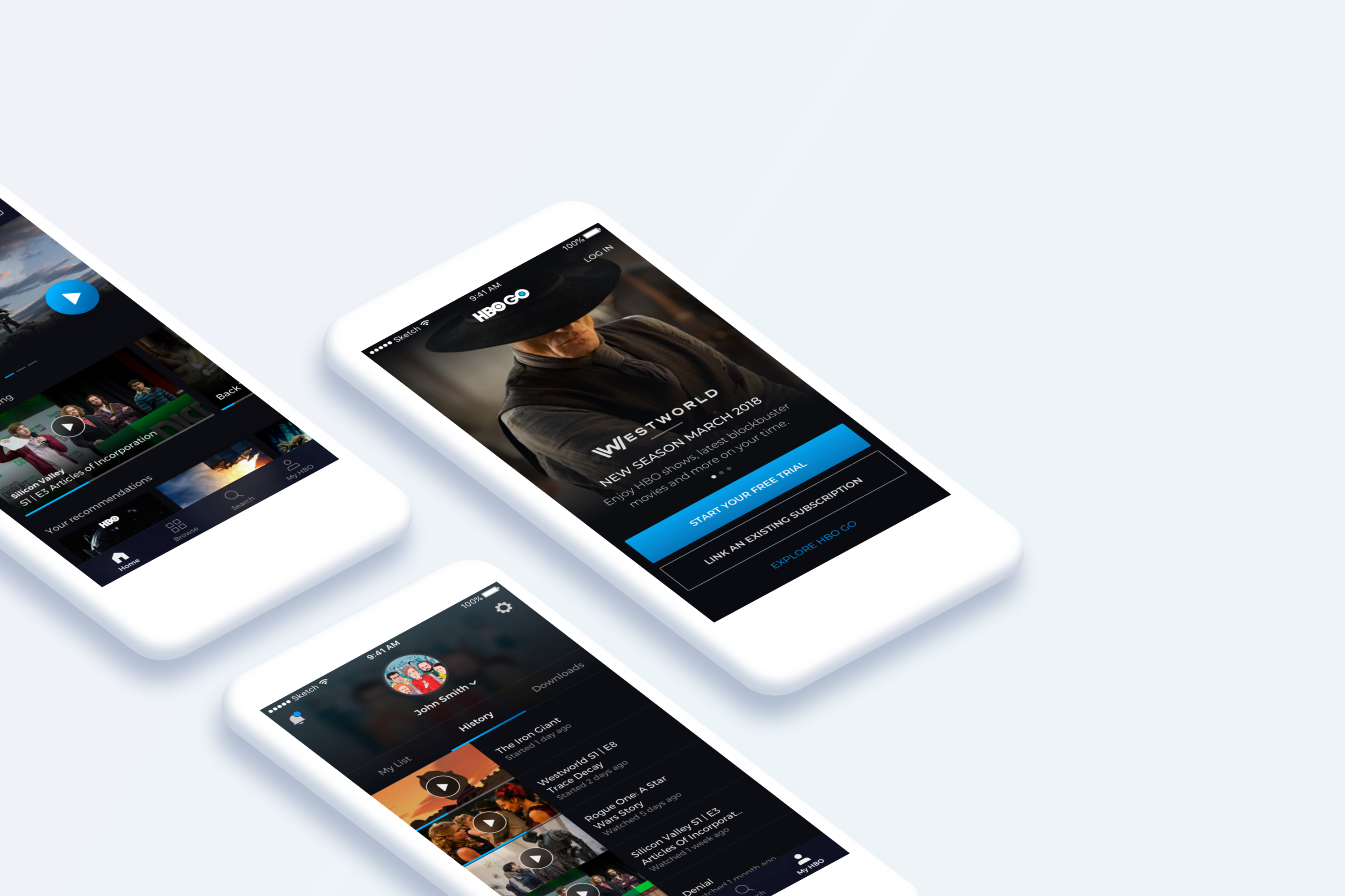
I worked as the lead UX designer spearheading the effort to re-design the user experience for the onboarding flow for the HBO GO App. The existing onboarding was extremely difficult to use since the flow branched off into various different paths. The app also didn’t have In-App Payments at the time, so a large part of the project was to introduce IAP and balance them with other paths such as existing user registration, TV provider sign in, and more….
Services
User & Competitor Research
User Flows
Usability Testing ( Writing scripts, Monitoring tests, and Analyzing feedback)
Low-Fidelity & High-Fidelity Wireframes
Hi-Fidelity Design
Platforms
Mobile
Web
Goals
Our main focus was to improve the user experience for the on-boarding flow by consolidating and simplifying the flow.
As the product lead I was in charge of leading the user experience, wireframing, looking at existing analytics and looking for areas of improvement, helping conduct user testing, and more.
Data Driven Design
We had a lot of user feedback from the existing application which helped us to come up with a UX plan. By first listening to users, reading app store reviews, analyzing the current analytics, conducting competitor research, and doing UX exercises with the team we were able to identify the main pain areas for our users. We then proceeded to wireframe with the main focus to fix those pain areas and create an A & B version to test. Based on user testing feedback we iterated and narrowed down to one near perfect version which we prototyped and tested again.
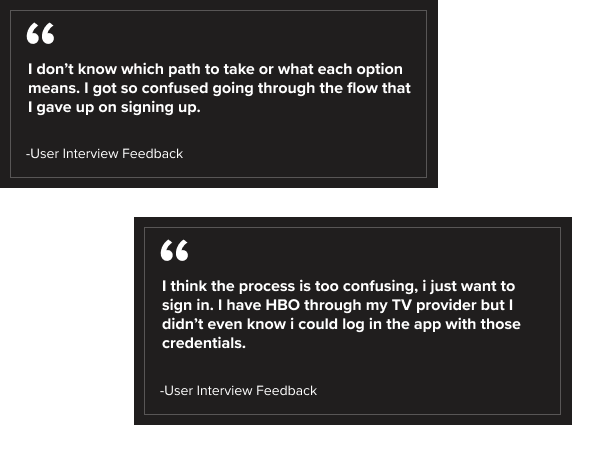
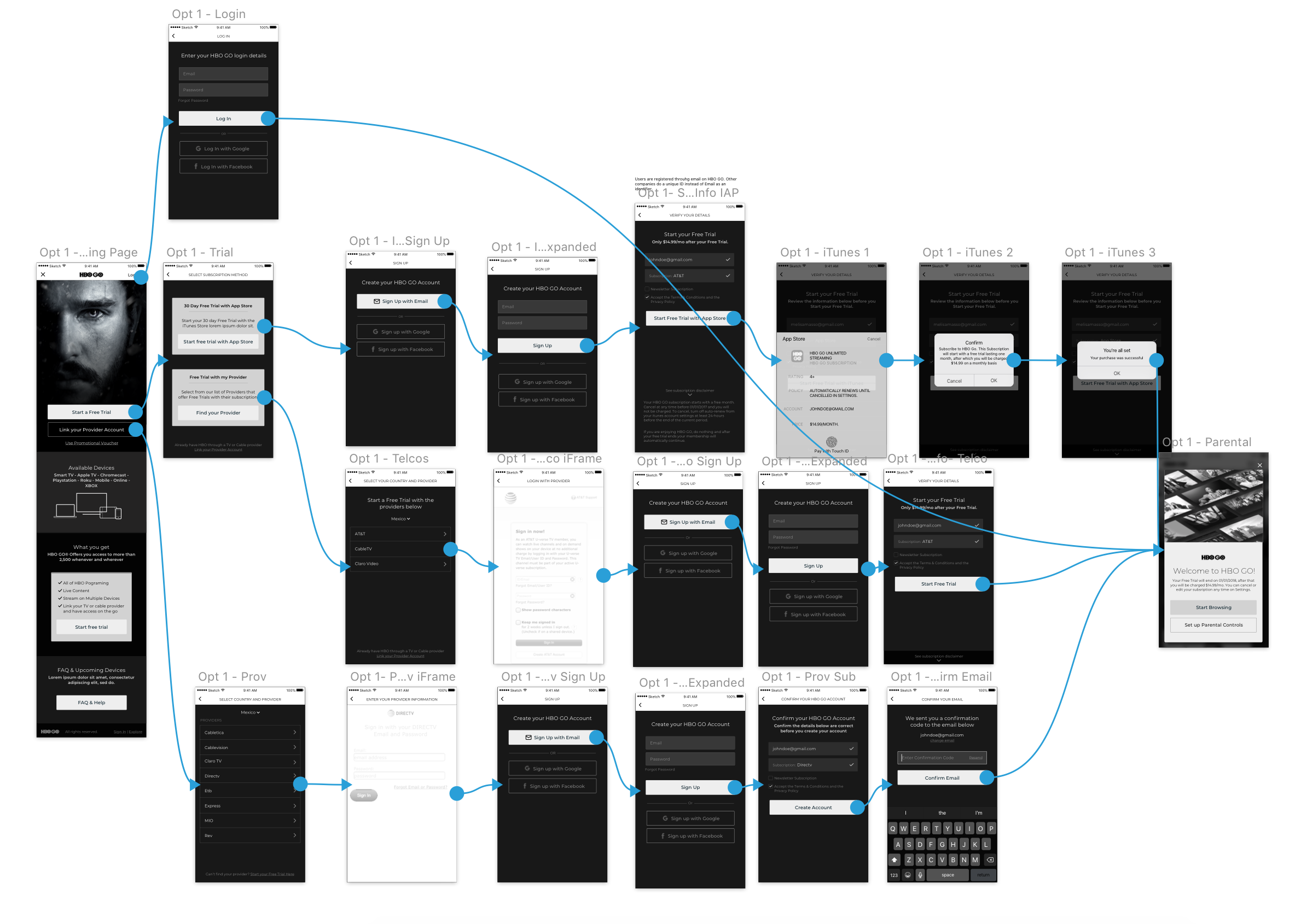
Wireframes & Flows
After spending lots of time in user interviews, doing competitor research, and brainstorming I came up with a flow to solve the issues and consolidate the experience. We were able to reduce the amount of steps from 7 to just under 4 steps in some flows. We tested various times with various iterations and arrived at a solution that improved the experience for users tremendously.
Challenges
This project had a ton of challenges with an especially hard problem to solve. Since the project included so many flows and paths a user could take, I had to balance path priority and making paths clear with simplicity. We also had a lot of pushback from the business side in which they wanted to promote one particularly hard path much higher than others.
Final Design
After arriving at a final design and creating hi-fidelity mockups. I was responsible for presenting this project to sr. management and gain their support on the new design. The improvements were successfully launched in the HBO GO app in all LATAM countries for both iOS and web.


